

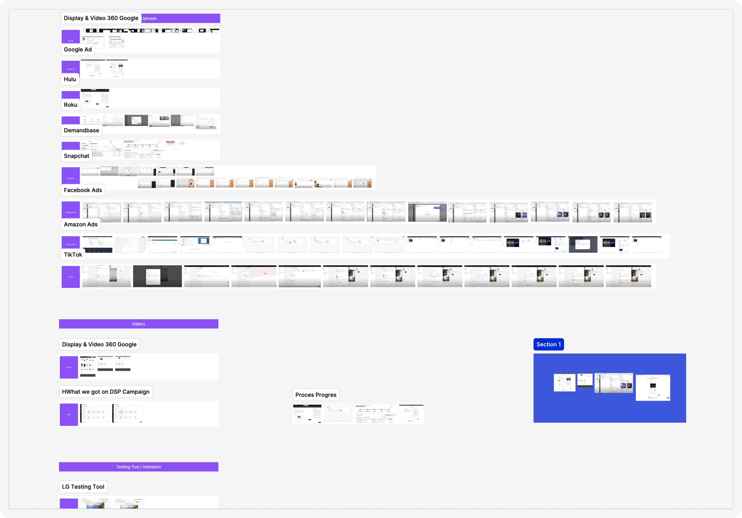
Creative Preview Gallery
Role: Lead Product Designer
Timeline: 12 weeks
Tools: Figma
Platform: Samsung DSP (B2B SaaS on web)
Project Overview
Background
The objective of this project is to design and deliver a platform for first time and self serve clients for Samsung Ads. In producing a campaign to launch, the client must submit a creative. Since Samsung offers a complex number of available creatives, it may be confusing and overwhelming for users. The goal of this project is to design an introductory gallery to showcase Samsung’s available creative template inventory.
• No current UI platform to explore available creative inventories
• No visual representation of end results of creative
• Not user friendly for first time users
The Problem & Challenges
Discovery
Collaborated with UX researcher to get in contact with targeted end users and went over the current user journey and pinpointed the usability pain points.
Information Architecture Exploration
Researched about every single creative Samsung offers and began mapping all the related data in order to explore different ways of organizing.
Layout Exploration
Explored different ways of connecting users to the entry point while keeping experienced users in mind via low fidelity mocks.
Usability Testing
After concept review with stakeholders, the mocks were upgraded to mid fidelity in order to correspond to the usability test script that the UX researcher and I came up with in order to hit testing objectives.
Iterations and Testing Round 2
Iterations were made based on the findings of the first user test. Requirements needed to be rediscussed based on the findings in order to produce the best experience that the users actually need.
Final Hand off - Mocks and Prototype
After a successful 2nd round of user test, mocks and prototype of all available creative inventories were produced and handed off to the product and engineering team.
My Involvement
50+ Mocks
4 Prototype Flows
Deliverables
Business Impact
• Provides self serve users a convenient UI to quickly understand and explore all the available creative inventories Samsung Ads provide
• Reduces the time for Ad Ops Sales to spend on educating self serve or first time clients about all the available creative inventories
• Aligned with marketing team to keep a one source of truth PDF for information that will also be easy to update
Discovery
Current User Journey: Pain Points
Meant for experienced clients, this drop down list provides little to no indication of their TV placement or visuals
Upon choosing a creative, it navigates you directly to the form with no descriptions or way to know more
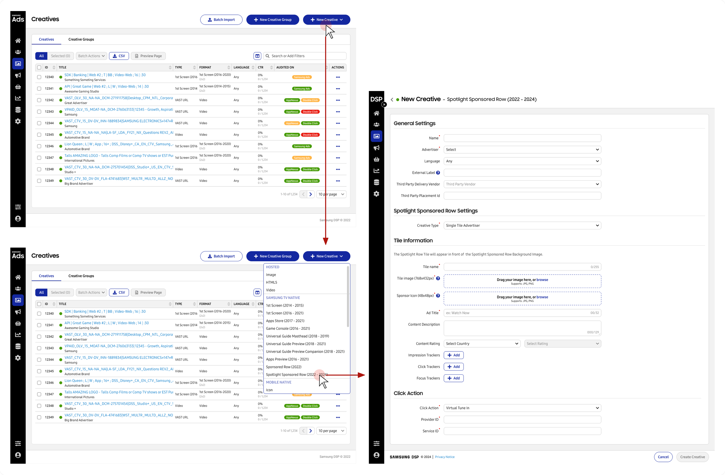
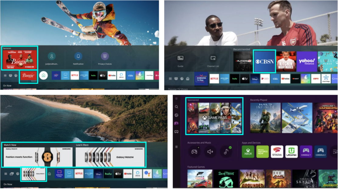
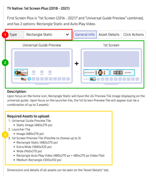
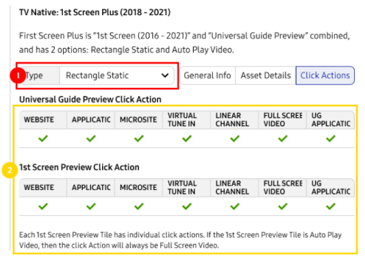
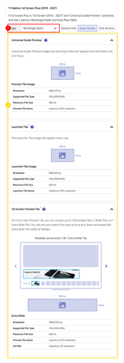
Understanding the Creatives
This Creative form transform into this on TV
Understanding the Users

Who are the targeted end users?
With the help of the UX Researcher, we were able to speak with several end users, which were self serve clients:
Most use case they already have the main media asset ready (either video or image)
Not sure what input fields are required, and where their placements are on the creative itself when shown on TV
Not sure what other possible creative templates exist other than what the Ad Ops recommend
Competitive Benchmarking
How do other competitors do it?
Competitive Benchmarking was done in order to understand what other ad platforms are currently doing to present available inventories to clients, and how their creative forms function? How do they pitch their creative, or show a preview?
Most competitors will show a preview on the side of the form to the users to showcase what creative will look like in the form of the ad.
Information Architecture Explorations
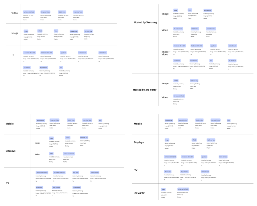
Exploring different ways to showcase information
After understanding each creative inventory type, I began to map out how the information architect can be organized. I took each exploration to the UX Researcher, several end users and SME, where we collaborated and worked on refining the information architect and organized them.
Summary
The organization with Mobile, TV, Displays and OLV/CTV made the most sense as they are all types of platforms.
Only Video and Images did not make sense as “TV” did not fit in the same category, but required its own section due to business needs.
Hosted by 3rd Party or Samsung, through user feedback, did not matter too much to require it’s own category
Low Fidelity Exploration
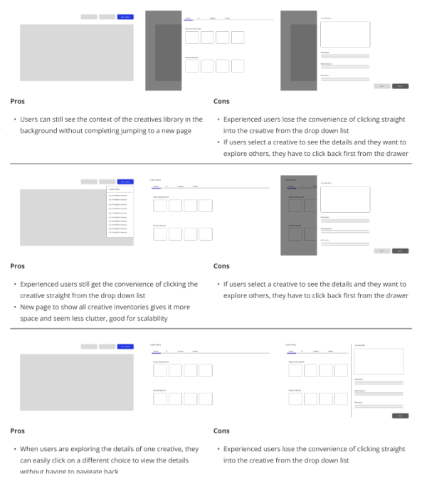
Layout Exploration - Deciding on a direction
After finalizing how to present the information in terms of hierarchy, layout explorations were done via low fidelity sketches
It is important to keep experienced and first time users in mind without sacrificing efficiency
Give experienced users the option to click into the inventory straight away, while lettings first time users the ability to explore
It is important to keep the options available on the side while exploring the details of the selected inventory to allow easy access back to other options without the user having to do too many clicks
User Testing - Round 1
The Layout - Successful
The four categories made a lot of sense to the users
5/5 users understood each tiles and found the icon and information with it very useful
5/5 users like how the information panel opens on the right, as they can still navigate to other tiles on the right.
The Icons - Successful
Users found the icons very useful as they indicate the placement of the creative on the TV at a glance.
The short snippet of information was also well received.
The Information Panel - Needs Fixing
5/5 users did not know they can click open the dropdown to change the type of creative here. Participants seem to think this is the creative form that they need to fill in
Users found the image indicating the TV placement to be very useful, and which button controls the ads
The required assets section was glanced yet. 2/5 users found them useful, however 3/5 users mention that is too much information
The Information Panel Part 2+3 - Needs Fixing
5/5 users did not know they can click open the dropdown to change the type of creative here. Participants seem to think this is the creative form that they need to fill in
While 2/5 users found these click actions helpful, 3/5 found them to be too long and detailed to be read. They rather this information be in a downloadable pdf that they can refer to.
Iteration - How I learned from the user test and iterated

Circle back to re-iterate the side panel, and the information displayed for the user (what are the most important information?)
I got a hold of the marketing side alongside with the Ad Ops in order to combine the sources of truths (There were multiple!)
Advocated to funnel users to the single source of truth, which will also make updating easier (But who owns this?)
If the users thought the side panel were a step-to-step to fill in the form, how can we fix this misinterpretation?
User Test Round 2 - The information panel iteration
What Changed and Why?
Since the overall layout was well received, only the informaiton panel was iterated
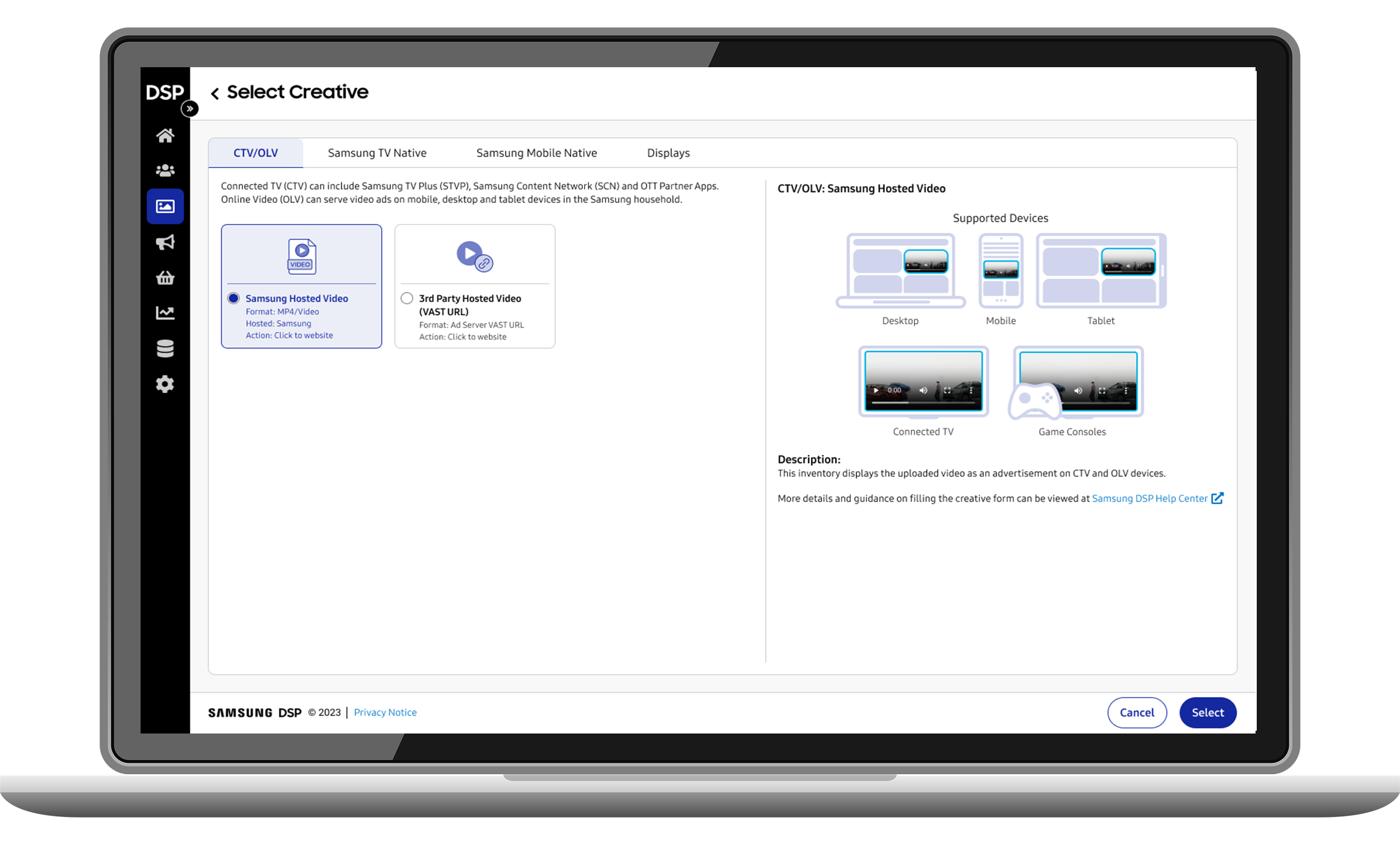
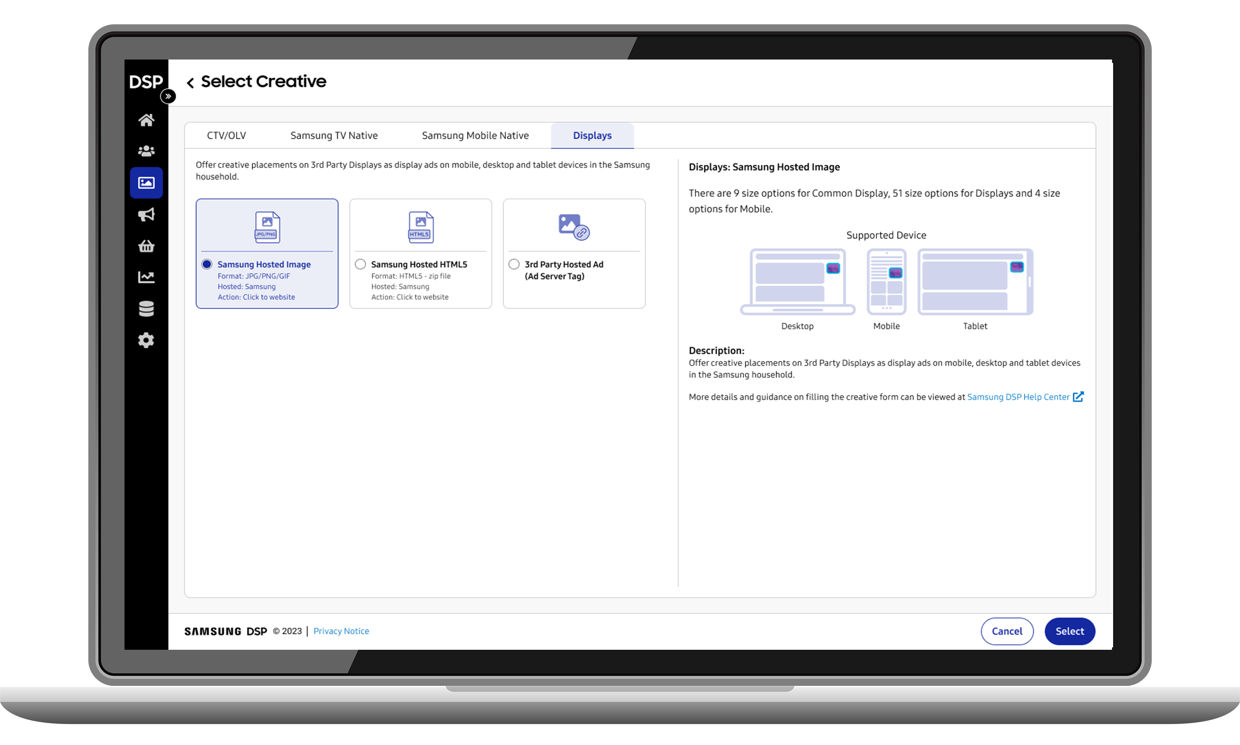
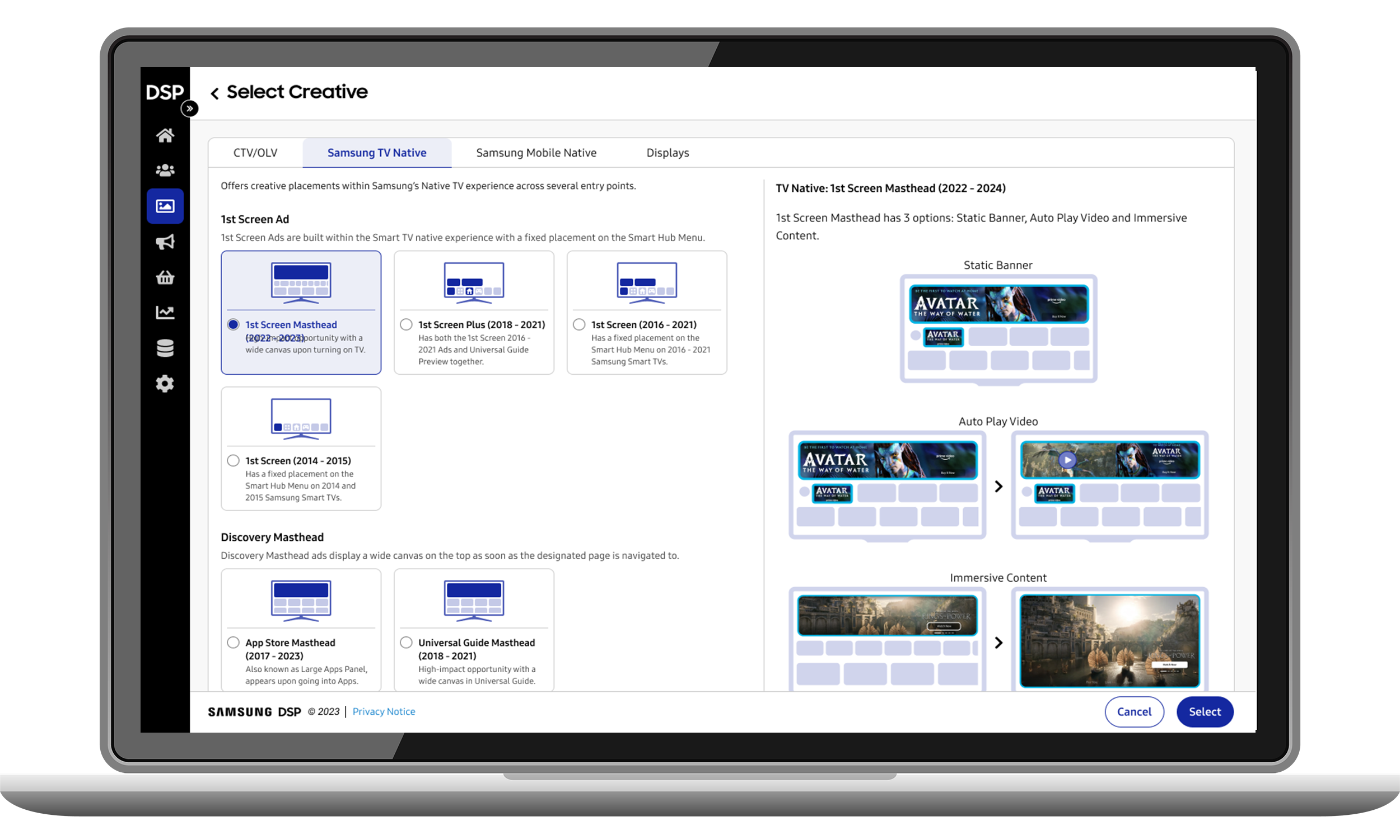
Kept the visuals since it was the most important for the user to easily understand the TV creative at a glance
Description was shorteneed and additional details can be accessed through an external link (The reasoning is because the user can download the pdf through that link when they are preparing the assets, rather than at this stage when they are expected to upload and submit the creative)
User Test Results Round 2 - Overall Successful
Overall the simplified panel is very well received, and no users mistook this as the actual form anymore
Visual presentation of the creative is the most cared for
Simplified description was passable as some users still found a more detailed description to be slightly more useful. However 3/5 users prefer to have all the details in an external downloadable pdf
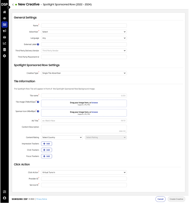
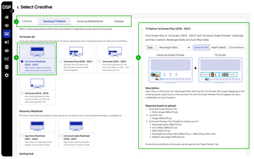
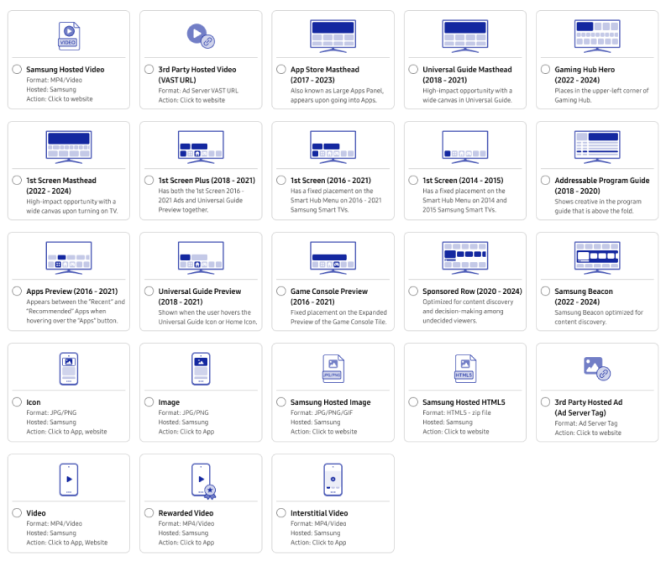
Final Solution Mocks

Key User Prototype Flows
Key Benefits and My Learnings

Key Benefits
Provides self serve users a convenient UI to quickly understand and explore all the available creative inventories
Reduces the time for Ad Ops Sales to spend on educating self serve or first time clients

My Learnings
It is better to go back to the drawing board when there is misinterpretation of users’ needs and question the project requirements.
User Test provided the opportunity to learn and grow from the findings in order to iterate a even better design solution for the users